Luminary
I began working on Luminary as a Team Lead and UI/UX Designer at its conception with App Team Carolina in January 2023, and I am still working on it today.
The Problem
After over 200 years of natural shifting, UNC Chapel Hill's sidewalks are wrought with bumps and lumps,
missing bricks, and deep puddles when it rains. In addition to this, there is constant construction, stairs
without ramps, broken elevators, and more inaccessibilities. While the university has made recent moves to
improve accessibility of the campus, such as building a permanent ramp up to the Old Well so students with
mobility limitations may still participate in the tradition of drinking from the Old Well on the first day
of classes, navigating accessibly remains a challenge for students with disabilities.
UNC Tar Heels At The Table (THATT) are a student group of disabled and disability-allied students looking
to make UNC Chapel Hill more accessible. They serve as an advisory board comprised that advises the chancellor
and other senior administration on issues of disability, accessibility, and inclusion on campus. THATT reached
out to App Team Carolina in the beginning of 2023 to collaborate on an iOS app that would, at a minimum, target
two primary issues via the following features:
- Easy posting of accessibility concerns and barriers for moderated review with opt-in push notifications.
- Auditory and visual navigation around campus that takes into account the posted inaccessibilities.
Preliminary Research
Prior to designing, it was important for us as a team to better understand the most prominent accessibility issues
faced by disabled students on UNC's campus. We started by interviewing disabled students through THATT, which provided
us with a foundational understanding of the problem we were trying to address from those most impacted. From there,
we designed a survey and distributed it through THATT as well as the Equal Opportunity and Compliance office at UNC.
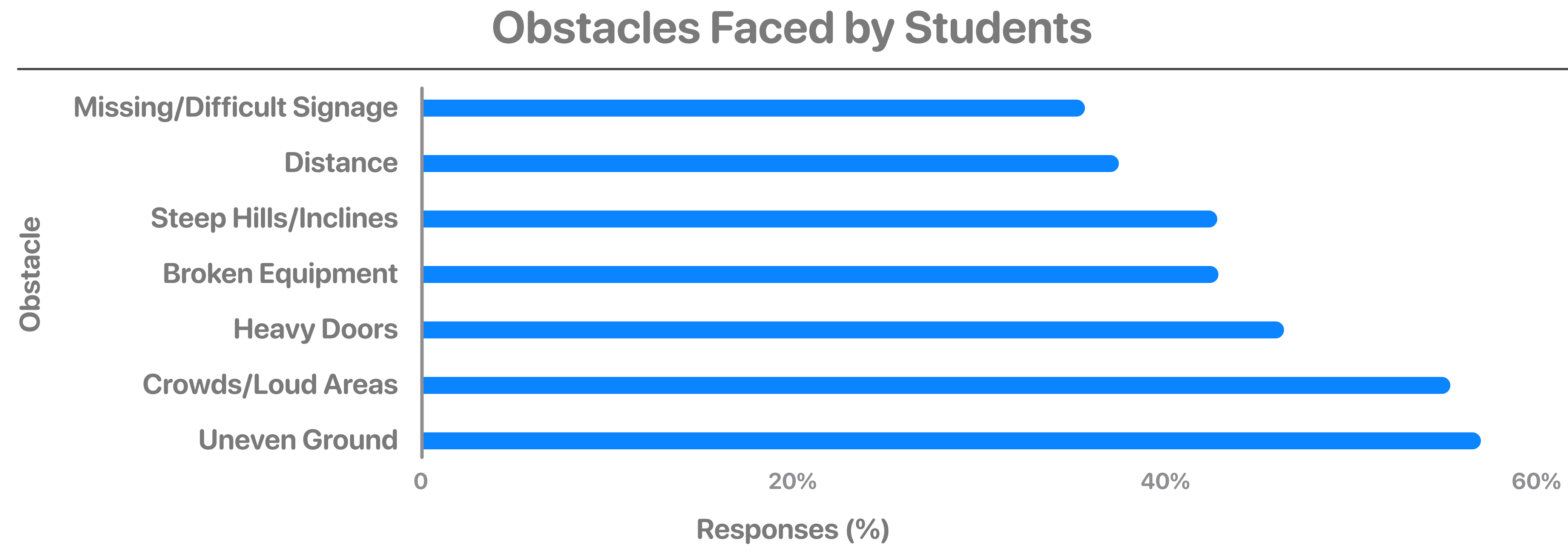
Below is a bar chart showing some of the results of the survey we sent out. It shows the percentage of respondants who
identified a set of issues as prominent on UNC'c campus. Based on the results, uneven pathways was identified as the most
prominent issue, but the other issues listed were also identified as prominent by 30 percent or more of respondants.

Working Towards a Solution
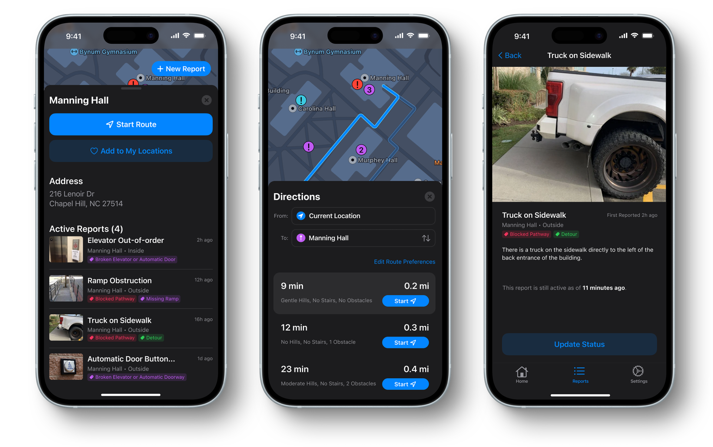
Over the course of the past year, my team was able to create a mimimum viable product of Luminary, which is now
available to a small audience on TestFlight for user testing. The app currently allows user navigation, which routes
around reported obstacles based on personal preferences of the user. It also features reporting, where users can post
about obstacles on campus for other users to see and, if opted-in, be notified about. Additionally, the app features
location favoriting, activity about reports, details and images about reports, and the option to mark reports as resolved.
Working on this project as a Team Lead and UI/UX designer with App Team Carolina has been incredibly fulfilling, and it
has been amazing to see how far the project has come.